前言
昨天,看到一个博客kangle,他的标题前面显示一列数字,好奇是什么,仔细看了一下,是浏览量,也就是阅读数,觉得挺好看
可能这标题大家看了不知道所以云,没关系,下面直接细说,先看看效果,记录过程
以前

以前的文章列表只有两栏,一个是图片,一个是内容摘要,本身也有浏览量及评论了,但觉得还是有点单调
现在
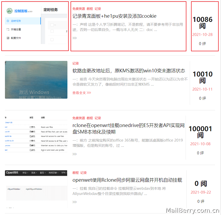
把浏览量和评论移到文章列表的右边,另起第三栏,这样是不是好看点,而且摘要也结实了很多,没以前那么空洞了。
过程
PHP文件
先在主题目录找到content-list.php文件,我的在wp-content\themes\Autumn-Pro\template-parts\content-list.php
在158行左右,<div class="entry-wrapper">增加一个div层,代码如下
 <!-- 新增mete-2层 -->
    <div class="entry-meta-2">
        <em>
            <?php if(wpjam_theme_get_setting('list_read')){ ?>

                <a href="<?php the_permalink(); ?>" rel="nofollow"><?php echo wpjam_get_post_views(get_the_ID()); ?> 阅</a>

             <?php } ?></em>
        <p>
             <?php the_time('Y-m-d') ?>
        </p>
        <p>
            <a href="<?php the_permalink(); ?>#comments">
                    <?php echo $post->comment_count; ?> 评
                </a>
        </p>
    </div>
<!-- 结束mete-2层 -->
CSS文件
先在主题找到style.css文件,我的在wp-content\themes\Autumn-Pro\static\css\style.css
在1194行左右,增加样式代码,如下
/* 新增meta-2 */
.post-list .post-wrapper .entry-meta-2{width: 20%;text-align: center;border-top: 1px solid #fff;padding-top: 40px;border-left: 1px solid #eaeaea;}
.post-list .post-wrapper .entry-meta-2 em{font-style: normal;font-weight: bold;font-size: 25px;}
.post-list .post-wrapper .entry-meta-2 p{color: var(--accent-color);margin-top: 10px;}

/* 结束meta-2  */
/* 開始meta-view及meta-comment不晃 */
.post-list .entry-header .entry-meta .meta-view{display:none}
.post-list .entry-header .entry-meta .meta-comment{display:none}
/* 結束meta-view及meta-comment不晃 */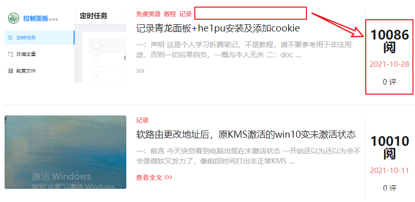
效果是把上面的浏览量及评论移到第三栏显示
适应移动端
在@media (max-width:767px){}代码里加上
    .post-list .entry-header .entry-meta .meta-view{display:inline}/* 移動端顯示瀏覽量 */
    .post-list .entry-header .entry-meta .meta-comment{display:inline}/* 移動端顯示評論數 */
    .post-list .post-wrapper .entry-meta-2{display: none;}移動端不顯示新增entry-meta-2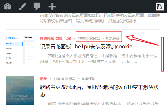
移动端隐藏第三栏显示,换回上面显示
额外CSS
这个是为了不更改原主题的CSS文件,单独提取出来的CSS文件,直接放到主题设置的额外CSS文件里,这样升级了,也有可能还能保持修改的内容不被覆盖
代码
/* 新增meta-2 */
.post-list .post-wrapper .entry-meta-2{width: 20%;text-align: center;border-top: 1px solid #fff;padding-top: 40px;border-left: 1px solid #eaeaea;}
.post-list .post-wrapper .entry-meta-2 em{font-style: normal;font-weight: bold;font-size: 25px;}
.post-list .post-wrapper .entry-meta-2 p{color: var(--accent-color);margin-top: 10px;}

/* 结束meta-2  */
/* 開始meta-view及meta-comment不晃 */
.post-list .entry-header .entry-meta .meta-view{display:none}
.post-list .entry-header .entry-meta .meta-comment{display:none}
/* 結束meta-view及meta-comment不晃 */
@media (max-width:767px){
    .post-list .entry-header .entry-meta .meta-view{display:inline}/* 移動端顯示瀏覽量 */
    .post-list .entry-header .entry-meta .meta-comment{display:inline}/* 移動端顯示評論數 */
    .post-list .post-wrapper .entry-meta-2{display: none;}/* 移動端不顯示新增entry-meta-2 */
}
总结
其实没有自己想像中那么难,哈哈,算自己做了一次作业了,只要是增加层,增加CSS,一个在PC端显示,隐藏;另一个,在移动显示,隐藏。写代码还是挺有乐趣的,至于好不好看,那已经不是那么生重要了。


暂无评论